Tag Archives: How To…

April Challenge 2

I am determined to do better this month with the challenge than I did last Month, so I have started early and created a pop-up box. There are a variety of free templates online for this type of box, however it is also one of the simplest to create your own template for.

20160402_134048.jpg

There are four sides to a box, so you need to have four sections which are equal in width, with enough left to the side to create a tab to fix them together. You will also need two small strips of card to go inside the box to support your decorations. These should be the same width as one of your sections + x1 cm at either end to use as tabs.

e.g. if your section width is 5cm, then your strip of card will need to be 7cm

The strips then need to be scored x1cm in at either end. One end should be a mountain fold and the other should be a valley fold – this will make the whole of the strip a Z shape. The Z shape will support better than a U shape and will also allow you to fold the box flat more easily.

Still assuming a section width of 5cm, the total width of your template will be 20cm + 1cm (tab). The height of your box will then be split into a top section and a bottom section, the top section can either be equal to or smaller than the bottom section, but if you make the top section bigger than the bottom section it is liable to overbalance.

Score along the section edges; so in my example, at 5cm, 10cm, 15 cm and 20cm. This should leave you with your 1cm tab side on the end. Decide where your dividing line will be between your top and middle sections then score along it – if you want your back section to stand up like mine does then leave the first section un-scored, so instead of scoring along from 0cm-21cm, score from 5cm to 21cm. Now cut down the score lines that are on the TOP section of your box down as far as your dividing score line, which means that you should be making 4 cuts to roughly halfway down your card.

Then cut a slanted line on your tab side to remove the 1cm top section, leaving you with a 1cm tab on the bottom section only.

Fold in all of your bottom section score lines to create your box shape; if you have a bone folder then use it to make your creases sharp, then fold out all of the top sections to create the ‘flower’. Stick the bottom section into shape using the tab, then stick in your Z strips. Personally I found it easier to stick one side of my Z strips into place before sticking the tab to close the box, but this is my preference.

In terms of decorating your box, it is again personal preference as to which stage you add your decorations; I attached all of the backing papers before closing the box, but stuck the embellishments on afterwards. The ‘pop-up’ decorations are all on construction weight acetate, don’t use the flimsy stuff because your embellishments will be too heavy! This can also be done before closing the box, but I would recommend checking that everything pokes out without getting caught on the sides before the glue dries…

CD Crafting

We all have our favourite ways to craft, things which we think will be a good idea when we try them, things that we think might be good idea but we are not sure; things that we try and then decide does not suit us at all and things that we try and decide are amazing!

This particular piece is a nod to CD crafting which has many benefits and is sometimes i feel a little overlooked. In general I like hand colouring and making an icky sticky mess when I craft, however one of the benefits of CD crafting is that you can print off any of the elements as many times as you like, which means that if your icky sticky part did not go well, you have at least not wasted the time and effort it took you to do the hand colouring part.

I like to use the CDs as relatively quick and simple images which i can then play with and try out different embellishment techniques without being too cross at my self for ruining what had been a perfectly good stamp. They are also good for character ranges and being able to match your insert to your main image.

The majority of the Christmas cards which will shortly be posted have been created primarily from a CD and I have then applied various forms of embossing, inking and sticking to make them a bit more than ‘cut and paste’. Have a look and see if you can spot which cards have which techniques!

18th Birthday Card Elements 2

Having created the basic brick wall, I now need to decorate it.

For this particular card I want to continue the theme of the brick wall because the main feature stamp is of mice (it will become clearer in a mo) so below, I am posting all three brick walls which I have done for this card and i will talk you through the embellishments.

wpid-20150914_154219.jpg

This is the finished front of the card. I have cut an aperture into the front of the card behind which I have then layered my snowfall acetate (Hunkydory). I have then cut the following dies from brown kraft card (to continue the sepia tones) and then lightly inked them up with distress ink.

  • Spellbinders flourish (left hand-side)
  • Tattered lace heart buttons
  • Tonic flourish
  • Tonic Brangwen briar (the butterfly swirl)
  • Tattered Lace Trent layering plaques
  • Xcut tags
  • The number 18 is from a set of numbers I got with a Tatty Ted alphabet and numbers set.
  • Tattered Lace free alphabet from the front of one of their magazines

I have also then added glitter, partly because the birthday is in November and therefore likely to be frosty, but also to pick up some of the edges so that the tones do not all merge into one another.

The ‘Sew Special’ stamp was part of the mice, here i have used it as the shop name, with the number 18 being the house number and the writing on the plaque is die-cut and then covered in pebeo gilding wax (empire gold); the date being the year of birth for the recipient.

Going inside the Shop…er….card….

wpid-20150914_154053.jpg

I have kept this quite simple, most of it is self explanatory however I did want to mention brick wall number 2. I have hand-drawn the ladders which as you can see, then go to different holes in the wall that lead to different areas of the warren. The feature stamp in the one we can see, which i have also framed in some more brickwork to give the idea of going into the mousehole. The tags sign post which hole leads where.

Through the hole…

wpid-20150914_154005.jpg

This then is the other side of the ‘Patterns’ tunnel. It is not completely finished because I need to add in a ladder and i will also draw some abseiling lines for the mice to get to individual patterns along with a sign for the shopfront. Both sides here are part of the pattern room, the blank square is for the personal message.

I have not yet done the back of the card; unfortunately I cannot leave it blank because despite my care and attention some ink has managed to find its way on to it (grrr) so I am toying with the idea of a moushole on the back of the card saying ‘Staff entrance’ and the hint of a human sized sofa…

Kraft Card 1

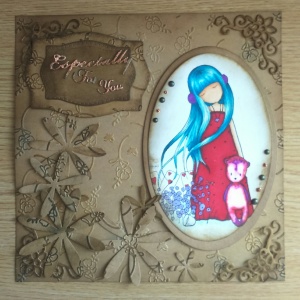
There is something about the colour brown; its a colour many people like to have in their home as part of their furniture, part of their clothing, part of their linen etc, but very few people, if asked, would say that their favourite colour is brown. Brown is not my favourite colour either, but I do like to work with brown craft card. Below is a quick tutorial on a card which I have made today, which is primarily, kraft card; I hope you like it!

Step one: Focal image

wpid-20150807_210026.jpg

This is the only bit that has colour; I could have done this in sepia tones which would then blend in with the rest of the card more however I quite like the contrast provided by the brighter colours.

Step two: Build the card

wpid-20150807_205033.jpg wpid-img_20150807_204954.jpg

My coloured image is quite large, so I have gone for an 8×8 format; I have taken a piece of Crafters Companion Kraft card and cut it to size, then embossed it with an 8×8 embossilicious folder (also from Crafters Companion). The next step is to make it more interesting, so I have used a mixture of Walnut stain, brushed corduroy and chipped sapphire Ranger distress inks to give it a frame and highlight some of the embossed flowers.

wpid-img_20150807_204853.jpg

Next, I have laid out how I intend to stick it all together, the additional items I have then added onto the page are:

  • Creative expressions finishing touches solid Daisies
  • Tattered lace corner dies (free on one of their magazines)
  • Tattered Lace ‘Especially for You’ words dies
  • Tattered lace ‘Trent Plaque’ layering dies

All of which have been cut out of Kraft card as well; the daises and the larger plaque have then also been embossed with the same embossing folder as the main background and inked to match. I have then heat embossed the words in copper so that they stand out

Step 2: Stick!

wpid-img_20150807_204816.jpg

Having laid it all out, I then decided to change the layout so the finished card is round the other way! I have then added a variety of PVA pearl drops (decadent oak, cosmic shimmer) and stickles (copper). Leave to dry and now it is ready to mount onto my card blank…